NOVEMBER’S TIP OF THE MONTH
Understanding Colour Relationships in Photography.
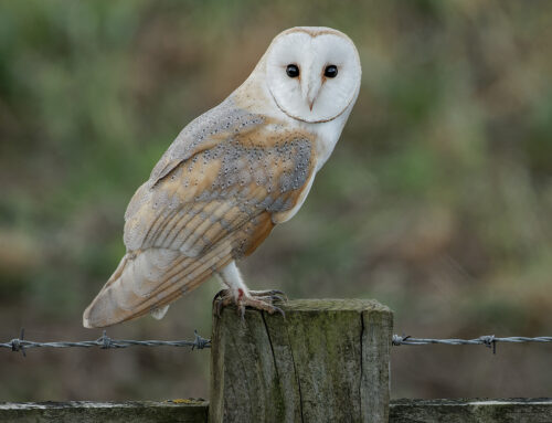
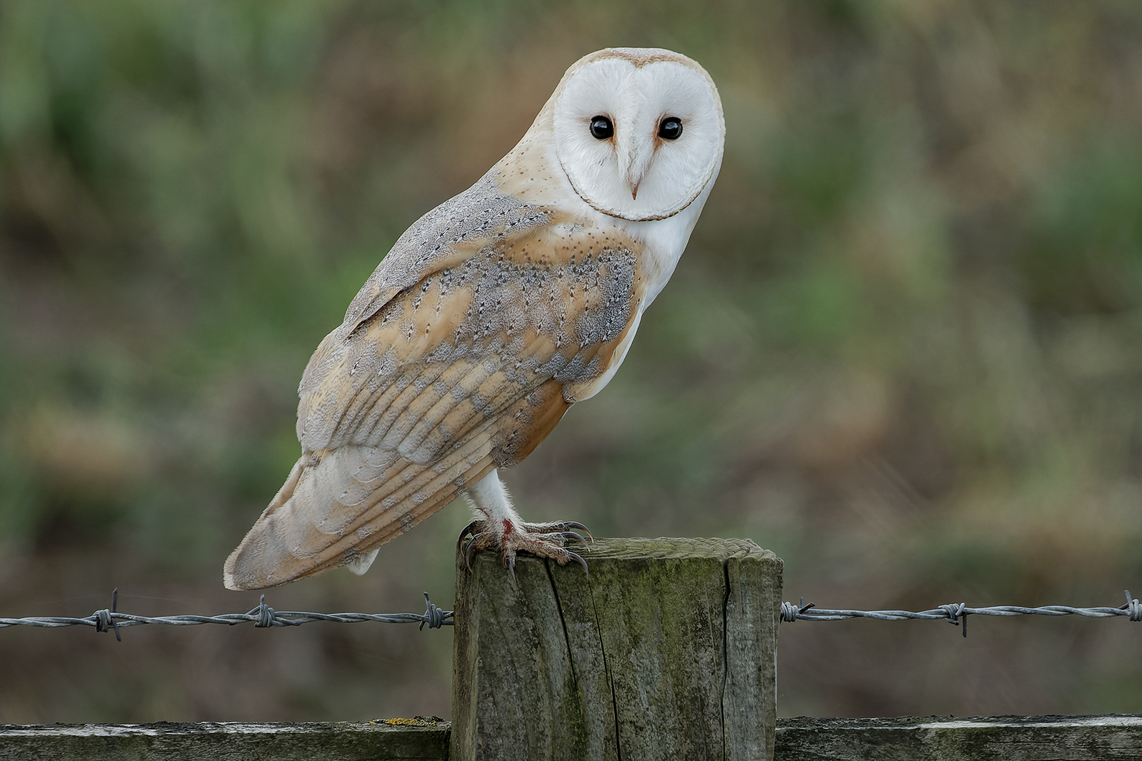
In photography, the colour wheel theory remains a fundamental concept for understanding how colours interact and how to create visually appealing compositions. Applying the principles of the colour wheel to photography can help you make informed decisions about colour combinations, balance, and mood in your photographs. Here’s how the colour wheel theory applies to photography:
- Complementary Colours: Complementary colours are pairs of colours that are opposite each other on the colour wheel. Using complementary colours in your photographs can create dynamic contrast and make the subject stand out. For example, placing a subject with warm tones (like orange) against a background with cool tones (like blue) can create a striking visual impact.
- Analogous Colours: Analogous colours are colours that are next to each other on the colour wheel. Using analogous colour schemes in your photographs can create a sense of harmony and unity. For instance, capturing a landscape with various shades of green and yellow can create a peaceful and cohesive image.
- Triadic Colours: Applying triadic colours involves selecting three colours that are evenly spaced around the colour wheel. This can add vibrancy and balance to your photographs. For instance, capturing a scene with primary colours (red, blue, yellow) can create a strong visual impact.
- Colour Temperature: Colour temperature refers to the warmth or coolness of a colour. Colours are often categorised as warm (such as reds, oranges, and yellows) or cool (such as blues and greens). Understanding colour temperature can help you choose the right lighting conditions to convey the desired mood in your photographs. For example, warm colours can create a cosy and inviting atmosphere, while cool colours can evoke a sense of calmness.
- Colour Harmony: The colour wheel theory can help you achieve colour harmony in your photographs by selecting colours that complement each other. Harmonious colour combinations can enhance the overall aesthetic of your images and make them more pleasing to the eye.
- Colour Balance: Proper colour balance is crucial in photography to ensure that colours appear natural and accurate. Adjusting white balance settings based on the lighting conditions can help prevent unwanted colour casts in your images.
Click on image to enlarge.

Come down to our Club Nights every Monday night from 7:30pm to 9:30pm at Roundhill WMC, for a fun pack night, with like minded people with a warm welcome!
Would you like to become a member?
Simply fill out the form below and we will get back to you with more details.


